Design and Process
Visual Identity & Packaging Design
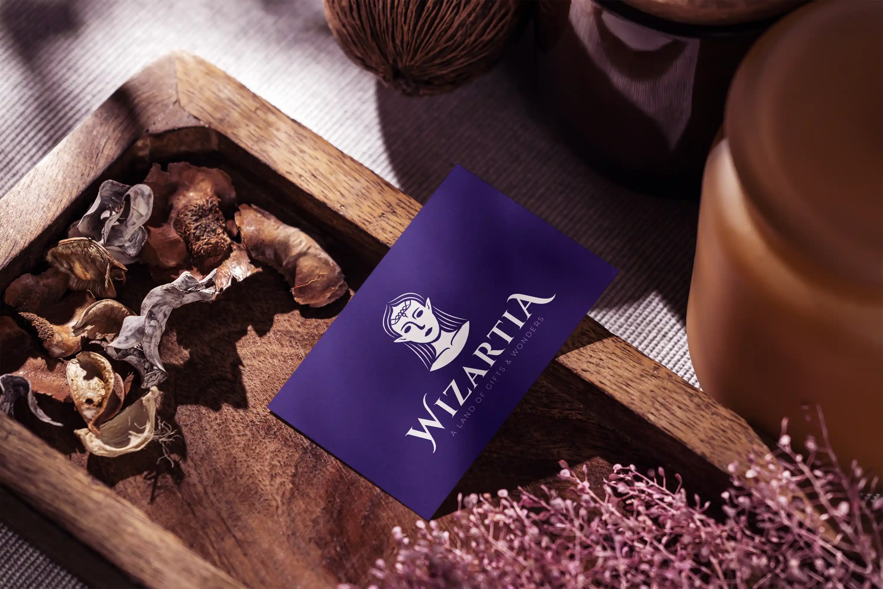
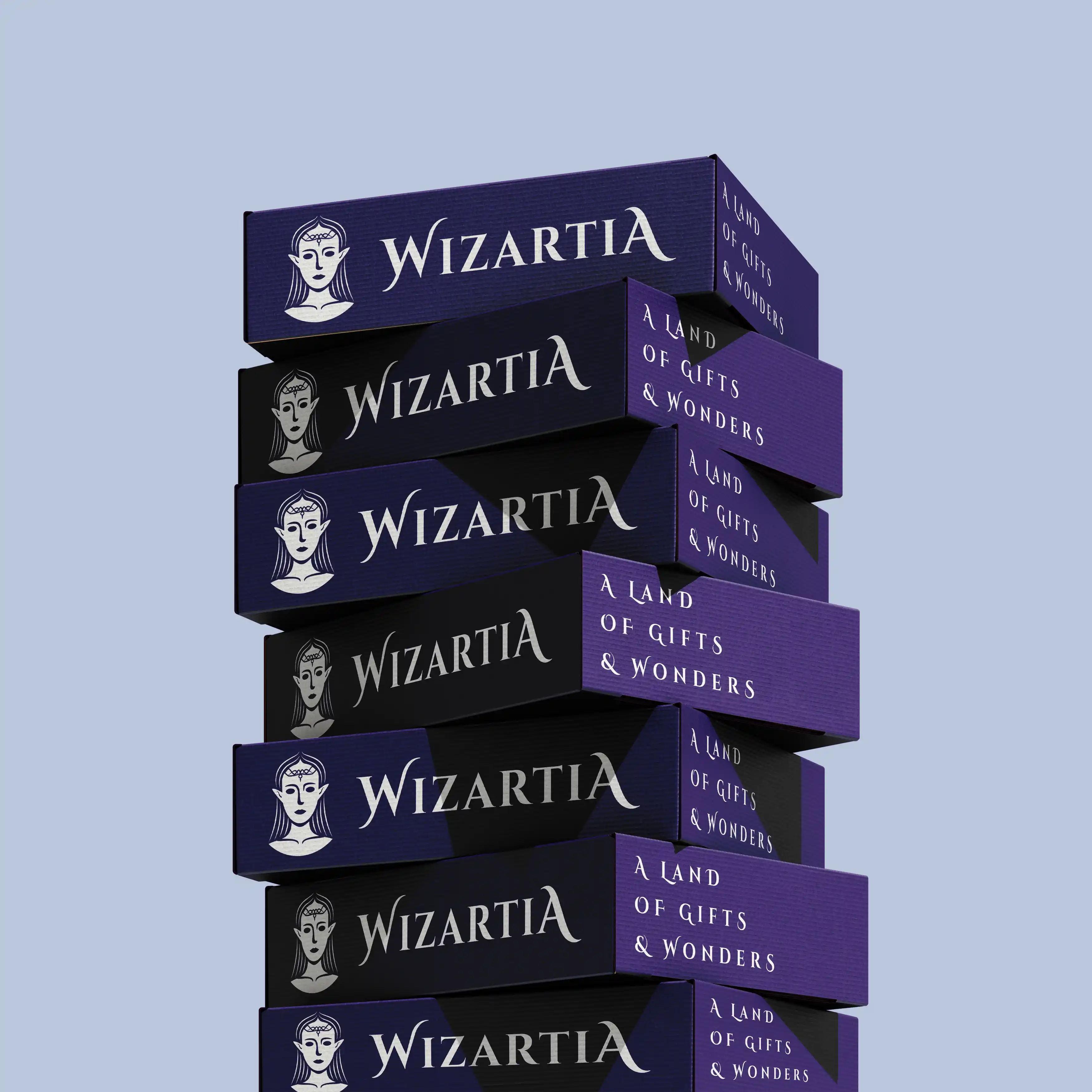
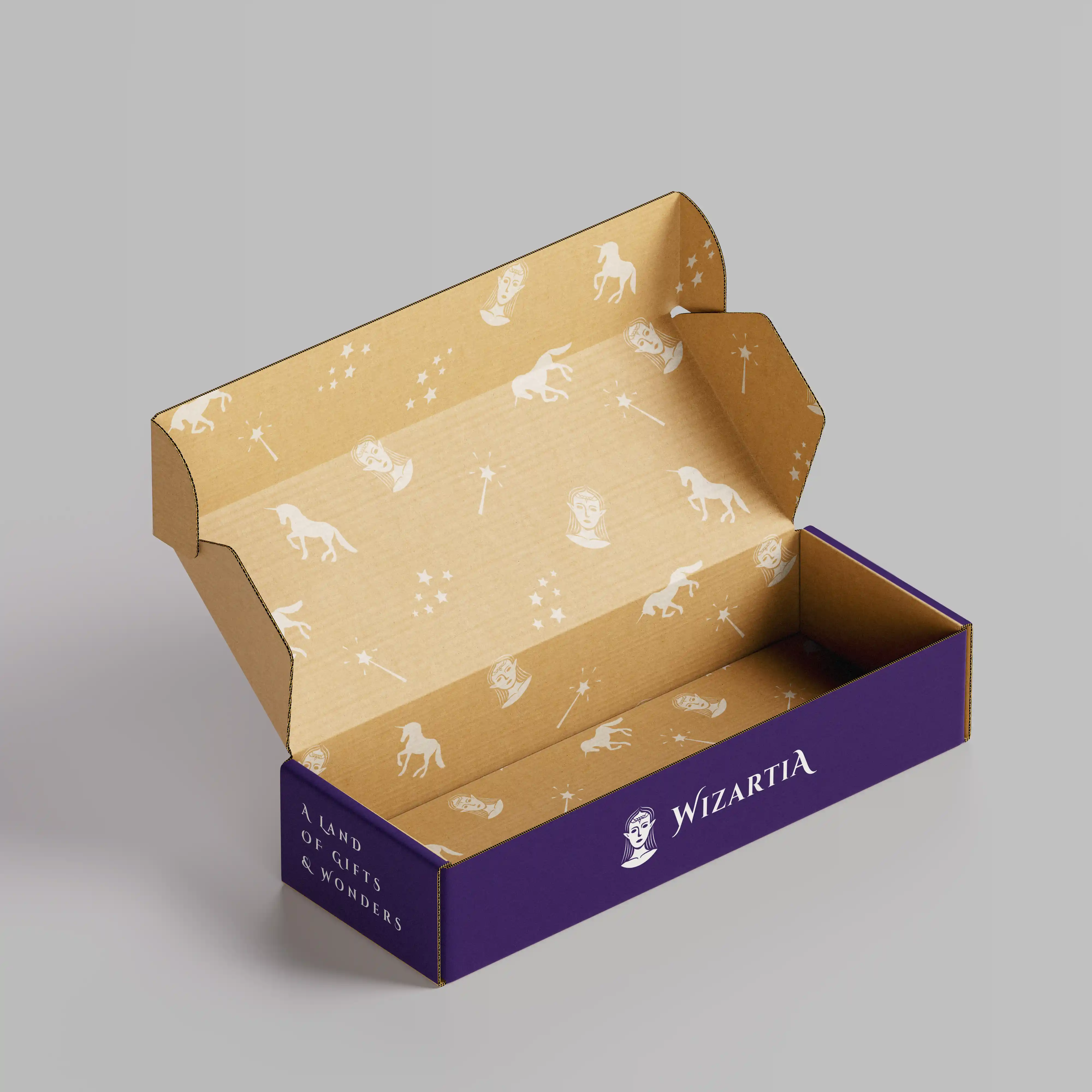
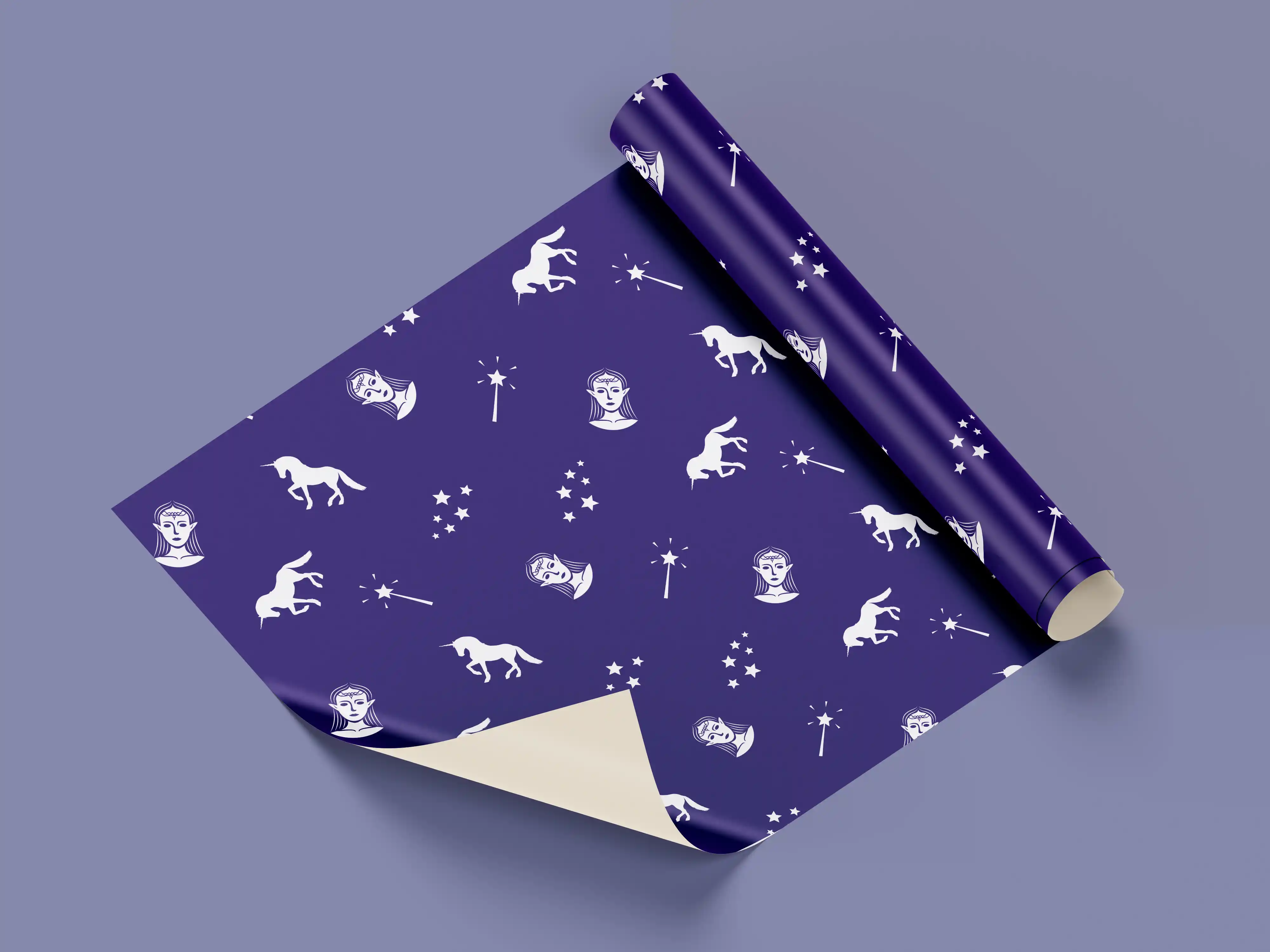
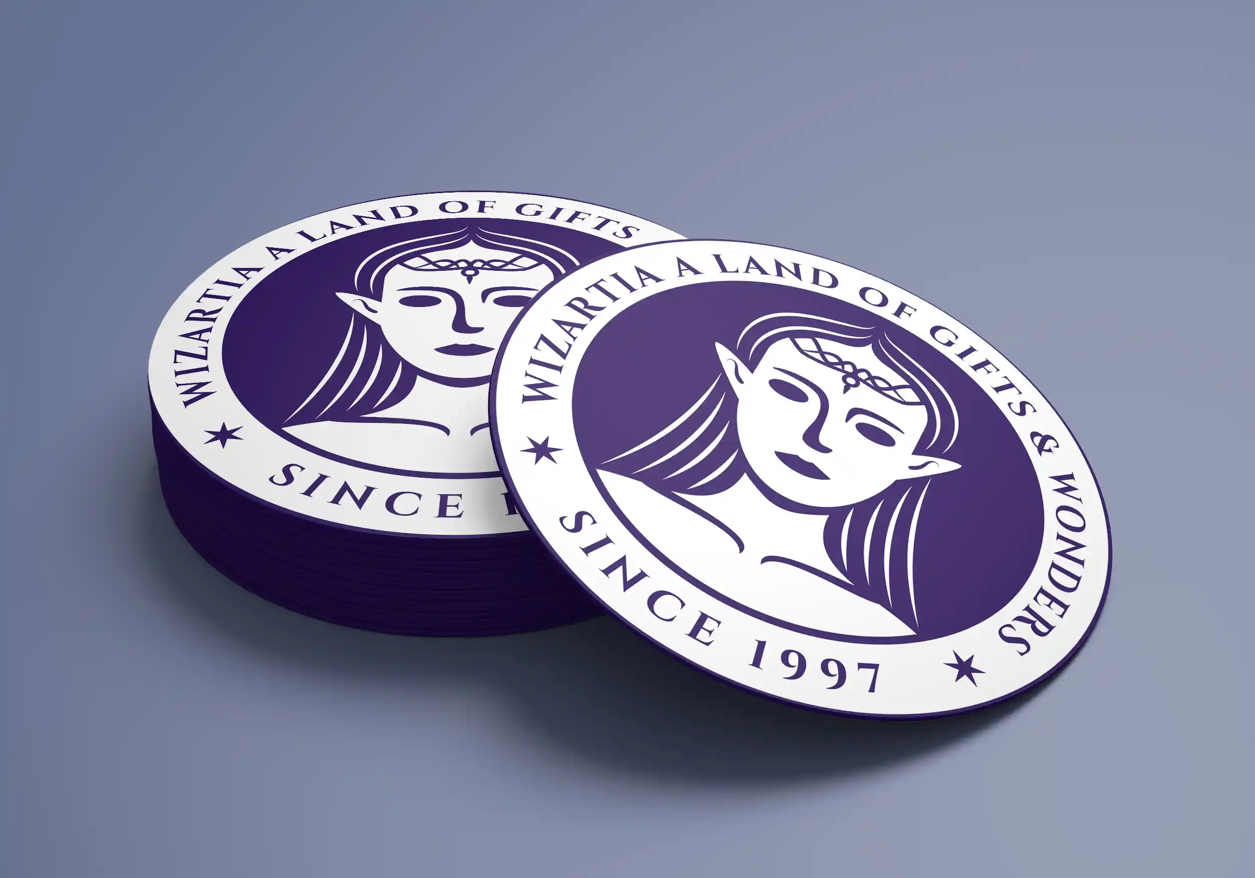
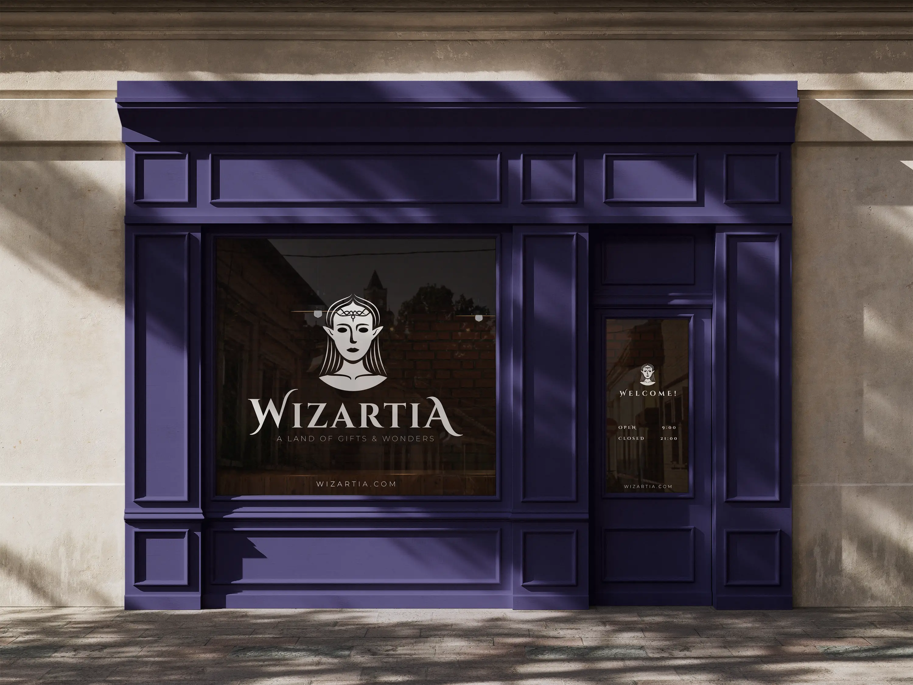
Wizartia is a fantasy-inspired visual identity created for a gift shop brand, blending elegance with a subtle sense of magic. At the heart of the identity is an elf princess, designed as the brand's central character and a symbol of kindness, imagination, and enchantment. Built around this character, the identity expands into a cohesive visual system including primary and horizontal logos, a badge, an icon, a supporting pattern, packaging applications, printed materials, and a logo reveal animation. The project demonstrates how a single character can unify a brand's personality while creating a distinctive and memorable visual identity across every touchpoint.
The identity began with designing the princess herself. Illustrated in vector software and kept deliberately minimal, so her pointed ears and calm expression
could define the character without overcomplicating the mark, since the symbol needed to translate from packaging labels down to a tiny web icon.
For typography, Cinzel Decorative was chosen for its roots in first-century Roman inscriptions — a serif with enough weight and ceremony to suggest royalty, while still feeling inviting rather than cold or corporate.
A deep violet was selected as the primary brand color, reinforcing the mystical tone without pushing the identity into anything childish.
Once the primary logo was finalized, the system was extended outward: a horizontal lockup for wider layouts, a circular badge for compact placements, a standalone icon, and a supporting pattern echoing the magical
world Wizartia is built around. Each extension was tested across different applications — packaging, print materials, and a short logo reveal animation — to confirm
the identity held together as a system, not just as a single mark. The result is a flexible yet tightly unified brand, where every element traces back to the same
idea: a princess whose world is built around gifts and wonder.
The logo reveal was designed to feel like a small piece of magic — a five-second moment that introduces both the princess and the brand's mark
together. As soon as she appears, she greets the viewer with a soft "Hi," immediately setting a warm, friendly tone before the magic begins.
The idea was to let her actively conjure the logo herself, tying the motion directly to the brand's core concept of magic, gifts, and wonder.
Her wand and the sparks around it remain subtle, preserving the minimalism of her design while establishing the magical atmosphere. A decorative
element formed from her spell races across the frame, revealing the wordmark in its path, while the sharp brake and slight overshoot at the end
add a sense of momentum reinforced by the sound design.
Together, these details create a short introduction to the brand's personality — mystical, yet approachable. The animation works naturally as an
opening for promotional videos, social media content, website intros, presentations, and pitch decks.
The strongest brands do more than sell products — they invite people into a world worth remembering. Through thoughtful storytelling, distinctive visual
identities, and carefully crafted details, design has the power to transform simple ideas into memorable experiences.
If you're ready to create a brand with a little more magic, I'd love to hear your ideas.